
ARTWORK AND PRINTING GUIDELINES:
A guide detailing our process and specifications that will ensure your prints come out looking top notch!
Basic Artwork Guidelines
ALL provided artwork must be sent at a minimum of 300dpi or preferably in vector format so the images can be scaled without any loss of detail. Vector file type examples (.ai, .pdf, or .eps)
Art files MUST be created and saved at the size (in inches) that it will be printed at. If anything, larger sized files will work fine because they can be scaled down into a print ready file. Any pixel based art can NOT be scaled up without compromising the integrity of the original artwork.
Artwork recreation and retouching is a service we offer if you cannot provide files at the above listed specs.
If you’re unsure if the files you have are acceptable, no worries! We can tell you pretty quickly if they are or not, and can offer solutions to get your files in proper working order so your prints come out perfect!
Fairies, Unicorns, Rainbows, Oh My!
So you’ve created this crazy elaborate, colorful, and whimsical design and now you want it printed on a t shirt. You even created a mockup to show us how you want it to look when it’s done. Here it is!

Screen printing is pretty versatile but not every image will translate into a cohesive image if you do not follow basic art guidelines for screen printing. Here are a few reasons why we wouldn’t recommend trying to print your amazing fairy unicorn design.
Images with hard borders, or that are rectangular in shape don’t usually work well as t shirt designs. The contours of the human body usually distort this otherwise square design. Not sure where to start or what we mean? Don’t worry! Our team of professional designers do this for a living and we are happy to assist and make sure your design is represented well on a t shirt.
Very fine details or colors with patterns fading into other colors aren’t always easily recreated with screen printing. That’s not to say it’s impossible, but the art file must be super high quality to start out with so proper halftone dots can be created.
Below is an example of a full color image that we printed using a method called 4 color process which utilizes halftone dots that overlay and intersect with each other at different angles to create a full color image. This process works best on white or very light colored shirts since the inks are transparent.
Close up of the 4 color process halftone dots
Full size image, the halftones are barely visible anymore
Simplifying Doesn’t Have To Mean Compromising
Consider re-thinking your original idea… Is there another way to create a colorful fairy rainbow unicorn that might work better for screen printing? I think so! The example image below only utilizes 5 colors (5 screens) and fits on the shirt nicely. This doesn’t seem like a compromise at all, in fact it might even be an improvement!
Ways To Save You Time and Money
Most screen printing companies have similar specifications when it comes to dealing with art preparation and making screens that will be used to print your design. If you’re a designer or someone who may be looking to have some items screen printed on a fairly regular basis, then these bullet points will save you lots of headache and confusion. And Money!
1. Use High Quality Images and Create Vector Artwork Whenever Possible
We can’t stress the importance of a high quality art files enough. If you provide a low quality image and expect greatness to come out of it that would be like buying frozen entrees from the grocery store and expecting them to come out of your microwave at the level of an upscale restaurant. It’s just not going to happen. Not without recreating the artwork from scratch. That is something we can do for you, but there is an hourly rate to do so.
2. Set Up For Success
Starting off in the right place goes a long way. We love when our customers are able to provide files in the following formats. However, just resaving and changing the file ending to one of these does not mean your artwork is now (for example) an editable .eps file.
Adobe Illustrator (.ai)
Editable EPS (.eps)
Acrobat PDF (.pdf)
Photoshop (.psd) at 300dpi and @ the size of the print
If you have questions about your files just reach out and ask us! If you have a logo that was created by another designer, it might be a good idea to reach out to them and ask them to send you the proper file types. If the logo was created by a professional designer, then all of those file types listed above should be available to you.
Want to use a couple different ink colors in the same print?
That’s Great! But it doesn’t always work the way you want it to. Changing text colors are easy and will look just fine. If you’ve got an image or a design that utilizes positive and negative space (Shadows and Highlights) then changing ink colors might make your design look a little crazy. See example image below... That’s what happens when you switch out the white ink out for black ink in the same screen. The black print on the bottom looks much better right? That’s a totally different screen.
3. Expand your fonts.
If you have a live or editable font in your image file, it may not be recognized by our computers if we don’t have the same font installed. The software will automatically substitute a default font for unrecognized fonts in your file which will compromise the integrity of the original design. You can either send us the digital font file so we can easily install it, or the easier way is to “convert all text to outlines” in your design before saving it. That way, our software just views that font as another part of the image and not live text.
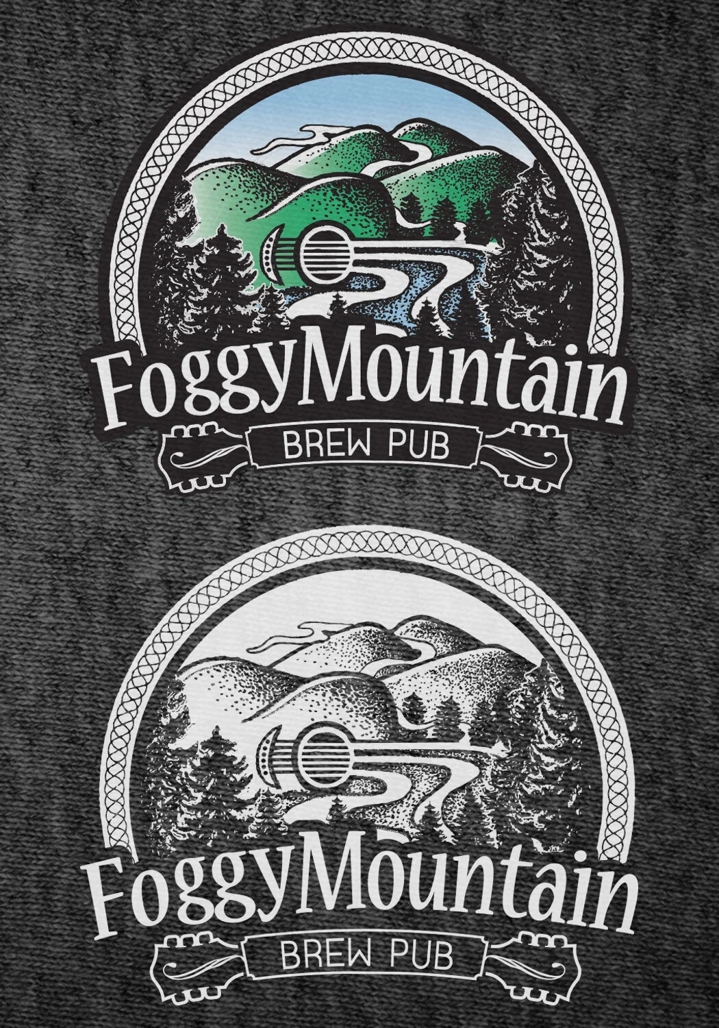
4. How Do I Save Money? Use Fewer Colors!
Every color in your design requires its own screen. In order to make a screen in the first place, we need to print out a film positive and prepare those screens ahead of time for the image. Adding more colors also adds more print time. This is why it’s more expensive to print more colors. Time is money. And let’s not forget, more time also equals more power usage, which is something we are actively trying to reduce. Scroll down below to see an example of how your colorful image can be converted into a nice 1 color print. Statistics show that less is usually more. Single color designs sell the best, and guess what? They cost the least to produce!
5. Still Confused?
That’s okay! We do this everyday so we know the ins and outs of the business. We don’t expect you to know everything. We know it can sound complicated and technical sometimes so don’t be afraid to ask questions. If you’re paying a designer to create artwork that will ultimately be printed onto a t shirt, it’s good for that designer to be familiar with the screen printing process so they can create a design that will be print friendly. We’re happy to assist you with this!
GIVE YOUR SHIRT SOME EXTRA STYLE!
We can spruce up your image with a few different treatments and printing techniques. T-Shirts offer a good opportunity to have a little fun with your logo and give your design a vintage or old distressed look. There’s no extra cost to do this either!
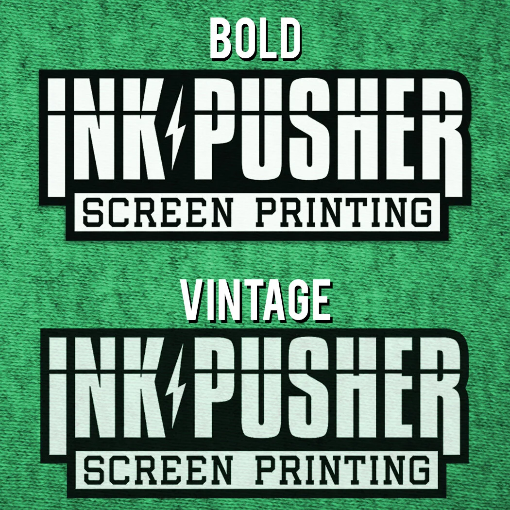
Vintage Print Or Bold Print?
The simplest way to explain the difference between these 2 styles is that a vintage print is a thinner layer of ink that allows some of the shirt texture and color to show through creating a more natural, worn appearance that’s also softer to the touch. A bold print has 2 layers of ink that make the print look more vibrant and solid but it also has a heavier hand and is slightly more expensive since it requires an extra screen and more time to print. Most of our clients love the vintage print in most scenarios unless the blank garment style or color lends itself better to a bold print (which we will recommend during initial correspondence if so). Vintage prints almost always look amazing on blended shirts like tri-blends or 50/50 cotton/polyester blends.
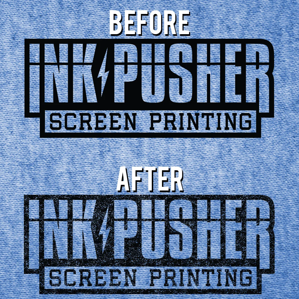
Add a Distressed Look
This is a fun option that we love to recommend to our clients. Think about some of your favorite t shirts for a second… most of them have probably been worn a few too many times, faded, and a little beat up. But that’s what gives it unique character and makes it special.
We can give your print a very similar appearance so your new shirts will look like you’ve been wearing them for some time already. And don’t worry, if you choose to do this we’ll send you a mockup of what it will look like before we print it. There are varying levels of distress that we can add.
More Colors More Money!
Make it 1 color. Save your money and the environment.
Screen printing is priced by the color. Each color in your design requires a separate screen. Therefore, more work, and more money. We get it, sometimes the colors represent your brand and you don’t want to compromise. That’s fine, all we’re saying is to take a minute and think about how important those colors really are. A lot can be achieved with a single color. Consider using a colorful shirt that represents your brand and print your design with a simple white or black ink. This will save you money and increase your profit margins if you plan to resell them. The average consumer doesn’t know how screen printing works and wouldn’t understand why you are charging more money for a shirt that has more colors on it.
Don’t have a 1 color version of your logo? We can help! One sign of a good logo is whether or not it can be clearly represented in a single color or not. If a professional graphic designer created your logo, chances are they sent you a 1 color version as well. If not, we’re happy to create one that you can use for screen printing.
Check out this example of a 4 color print converted to a 1 color print.
Split Fountain Prints
We love these! This is a unique way of incorporating colors into your design without adding more screens. We do lots of these prints when we’re live printing at events since we can’t bring our entire shop full of equipment out with us to do multi color printing. Blending the colors of the rainbow together is always a favorite.
How does it work? We add multiple ink colors into one screen and get them to blend and swirl together while we print the image. This means that every single print is unique. We do maintain some sort of uniformity when we’re printing so the prints won’t ever look drastically different than the others but they’ll have subtle variations. Not every piece of artwork works well as a split fountain, or may require some modifications. Ask us if a split fountain print is a good option for your artwork!
THESE ARE JUST A FEW EXAMPLES
Wanna add a little something extra to your print but aren’t sure how? Ask us and we’d be happy to recommend a few options that we think would look great with your design!